

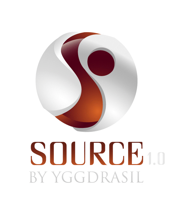
This is some logo design work I produced for Yggdrasil Gaming back in 2016 for a client hub they developed called "Source". As you can see I had some fun trying to find the best font for the job! This B2B service is still available on the Yggdrasil Gaming site. The image below shows inspiration that got this design started.
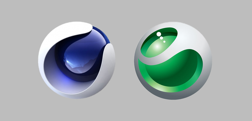
When starting of this project I took inspiration from these two logo designs. Can you guess them? :) I really liked this idea of a shell that opens a bit to show a transparent colored core that protects something precious. It was up to me to decide if I want to take a more 3D-looking or 2D vector looking approach and how to integrate an "S" into the design that can define that opening and show the layering of the design. I took the decision to design this logo using Adobe Illustrator and go for a vector look but still having this volumetric, futuristic, soft and organic look.
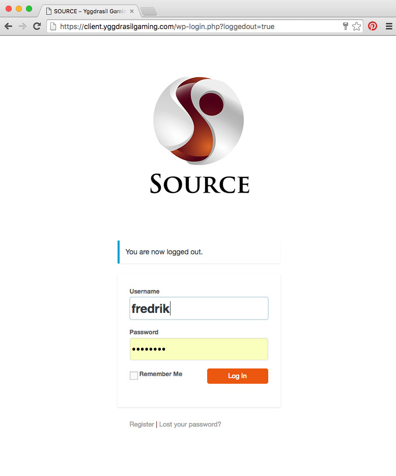
Here above you can see how it looked like on the website at first.
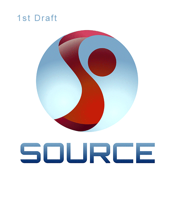
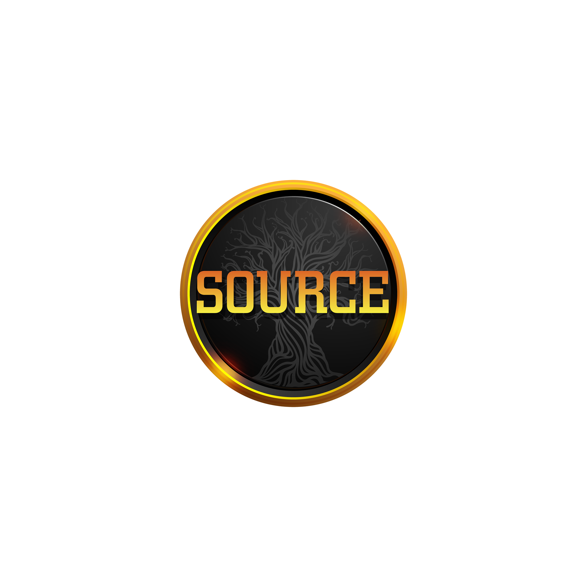
And below you can see the initial drafts and the final design (both 3rd and final draft were used before I left Yggdrasil Gaming in July 2016).
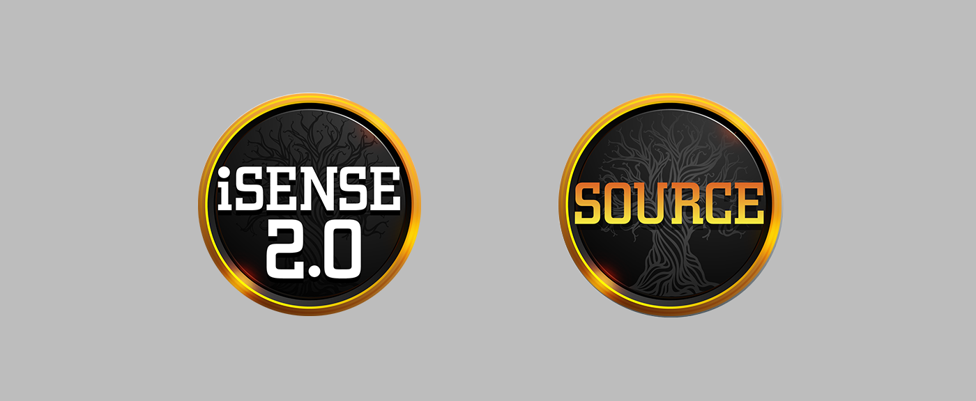
The reason for such a strong departure from the initial design was a need to link it closer to the already established branding language and similar product offering (iSense was the mobile platform offering that evolved from Flash to HTML5 technology). If I remember correctly some strategy changes were also key here since it's a completely different approach to create something new, but part of an already established brand visual direction or something completely new that can inspire a visual re-branding. Keep in mind this product was not public back then, so was not promoted on the main website. Therefore I assumed that it did not really needed to be part of the same visual branding effort when the initial pitch happened. Of course since then Yggdrasil Gaming grew it's offers in game, interesting products and opportunities that can be explored on their website.
Anyway I hope this process breakdown was fun to see, give me a like / appreciation if you think it's worth it. If you want to see the current design post the 2018 re-brand of Yggdrasil Gaming you can see it here or in the image below (of course, not designed by me, I show it here for comparison and closure purposes only!).
Also the rest of their product offering is here.
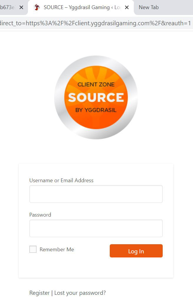
As you can see below the browser tab icon still kept the initial design I pitched!
I would guess it's because of better legibility at such a small size.
One last thing: When I started in 2014 Yggdrasil Gaming was an enthusiastic startup with a 6 people strong team in Malta and now in 2021 they are 180 people super established industry giant with offices in Malta, Poland, Sweden and Spain! I honestly had my ups and downs, may fair shake at challenges, wins and fails while working at Yggdrasil and I learned a lot during my time there from my colleagues, my boss and my friends in the industry.
Please be respectful to me and others if you intend to comment below.
Thanks for checking this out!